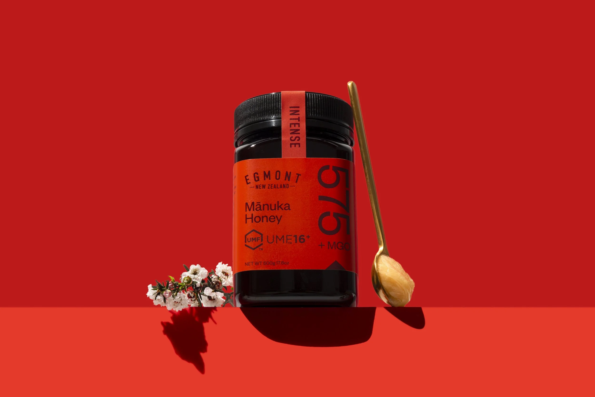
Egmont Honey 2.0
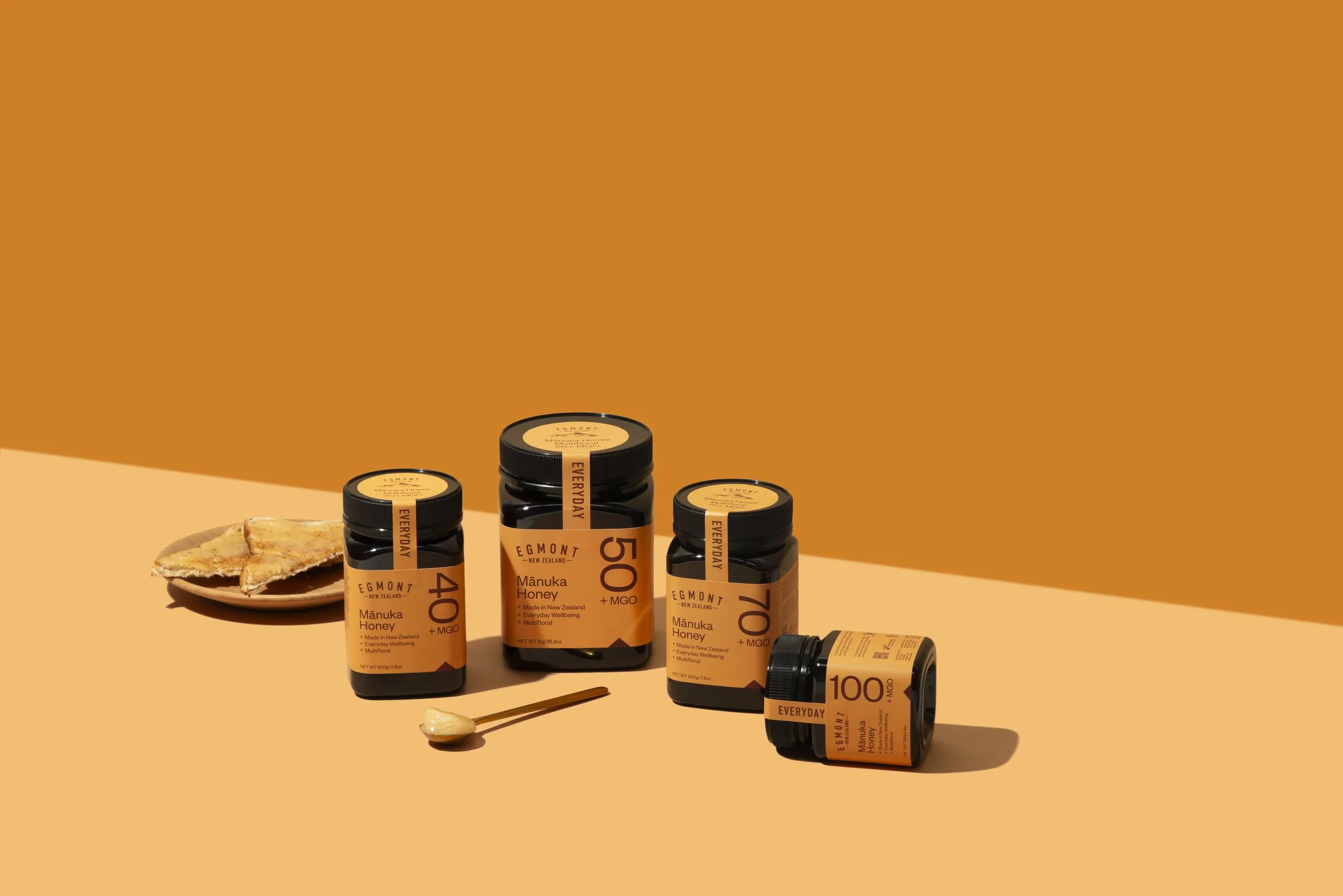
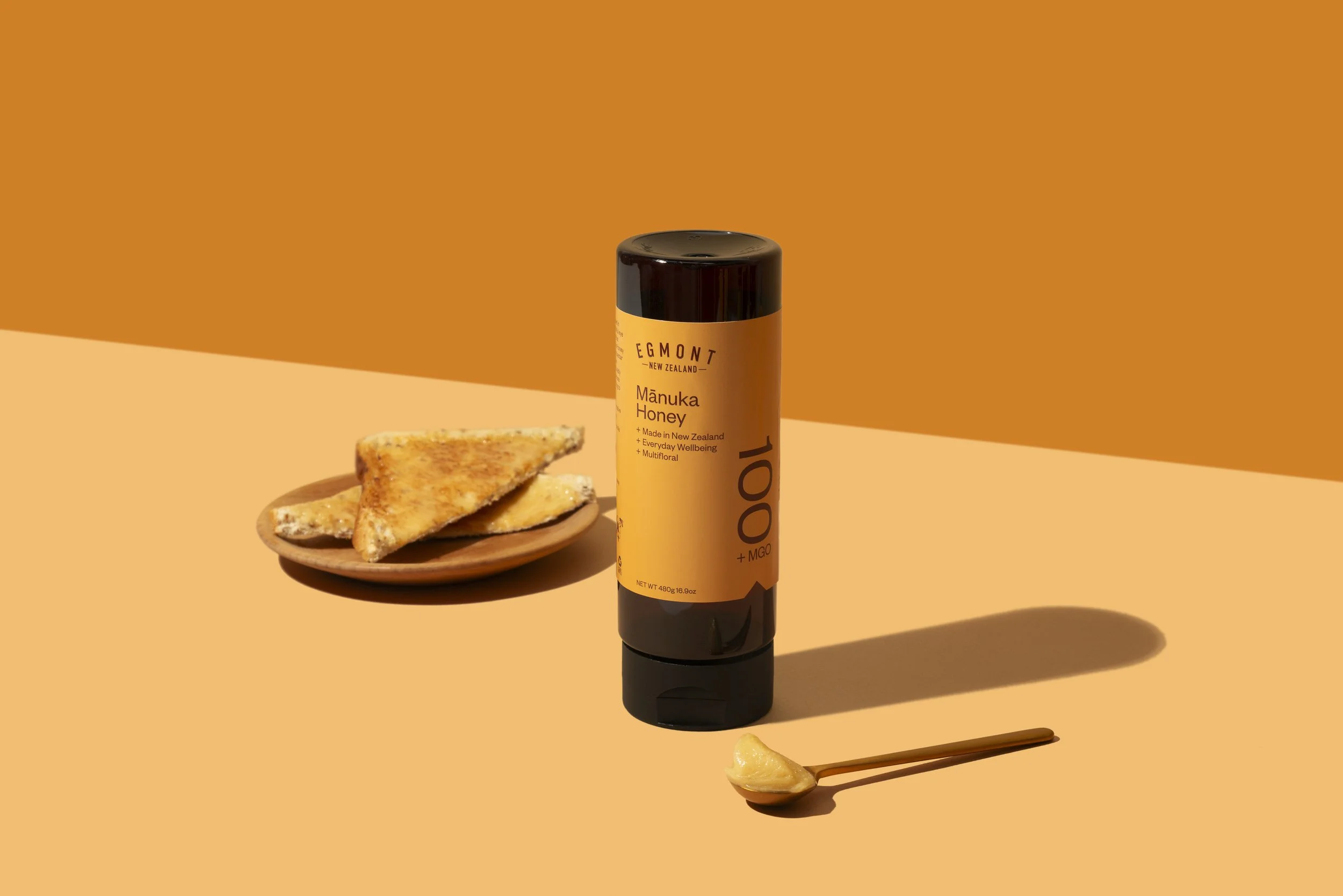
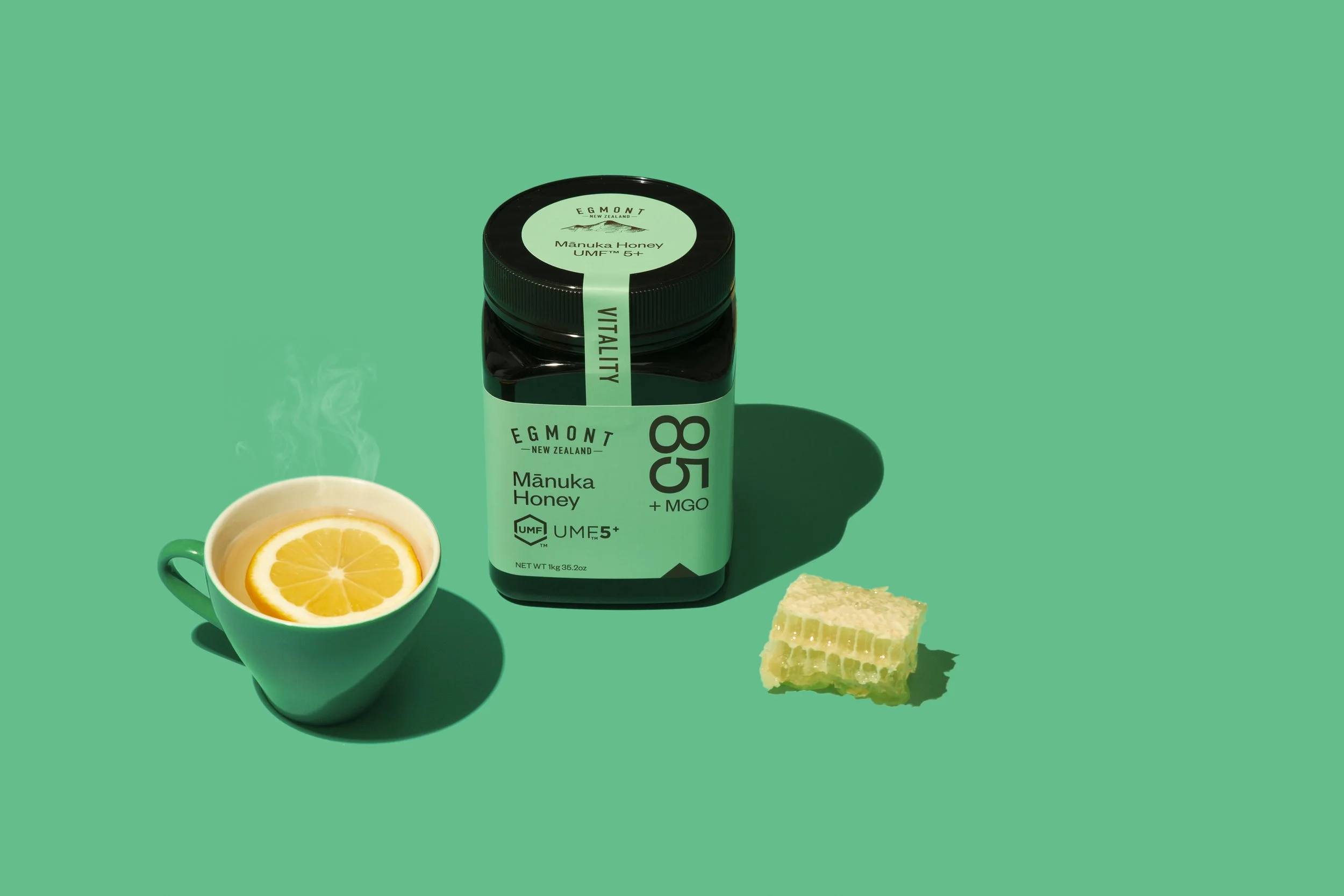
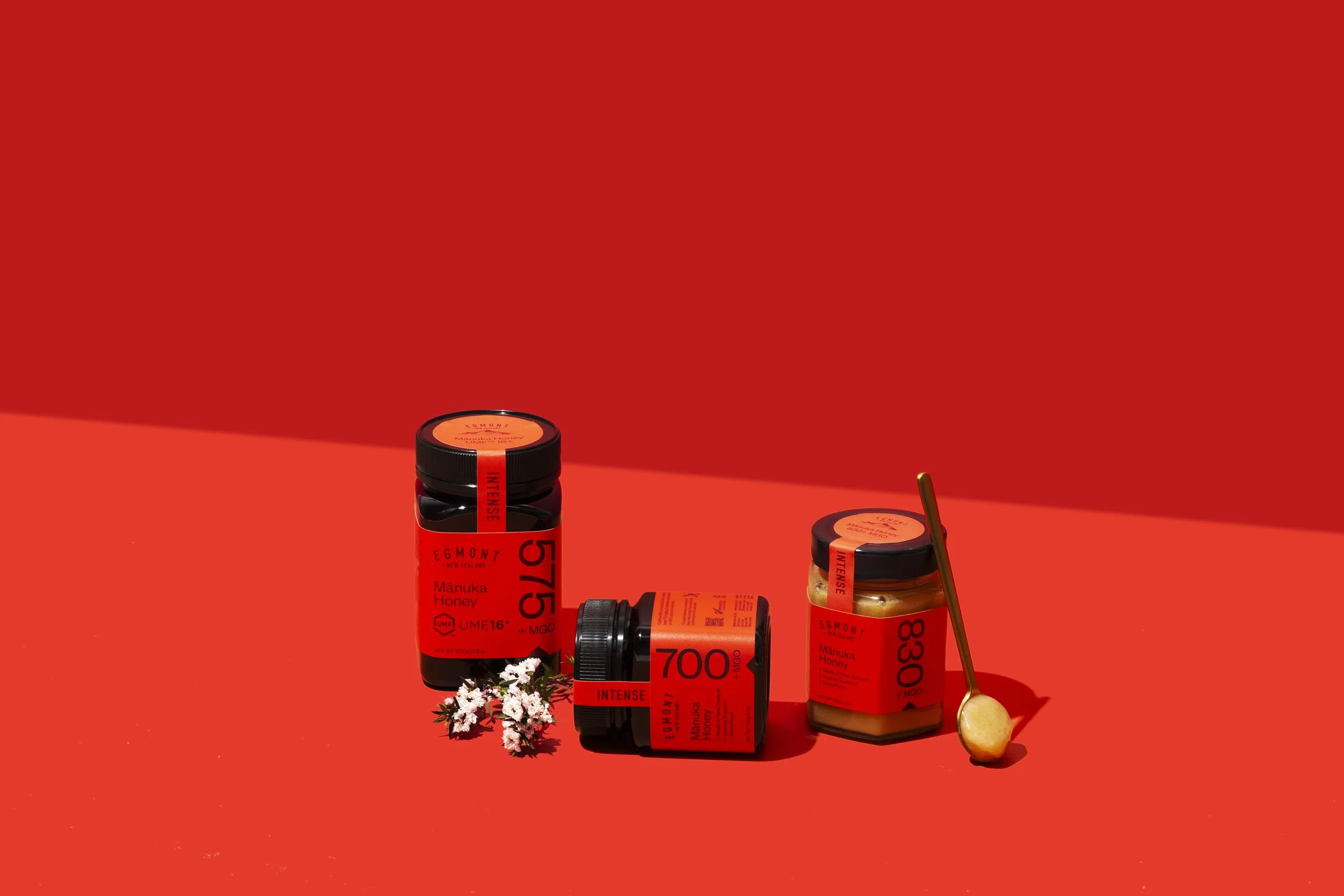
When the Egmont Honey brand recently celebrated 10 years of sweet success, it was time to ensure the brand was really standing out on shelf and communicating the many benefits of Mānuka Honey. After exploring several concepts, we developed a simple yet striking design to help customers navigate complex UMF and MGO ratings. We introduced an everyday yellow, soothing green and an intense red in a modern colour-blocking design, while the large type ensures the ratings are clear and easy to read.
The new designs have been well received by customers and retailers alike, with the range brightening up the shelves of Holland & Barrett’s UK stores, the Chemist Warehouse in Australia, and soon to be seen in Woolworths New Zealand and Australia. The full Egmont Honey range will soon roll out with this new look and feel – and customers are already making a beeline for them.
Deliverables included strategy, logo, label design, box design, shipper design, product renders, and creative direction for photography.
Visit their website
